Landing Page Components: MagicUI Review (2026) & Verdict
⚡ Executive Summary
Landing page components from MagicUI analyzed. Discover if these animated React elements can boost your conversion rates and design quality today.
Disclaimer: This review is based on publicly available information, including official documentation, pricing pages, and public repositories; it is not based on laboratory benchmarks or internal first-person testing.
As the demand for "premium-feel" SaaS landing pages increases, the gap between a standard corporate site and a high-conversion, visually stimulating experience often comes down to motion design. MagicUI has emerged as a specialized solution to this problem. Rather than providing a full-scale application framework, MagicUI focuses specifically on the "visual hook"—the high-impact landing page components that capture attention in the first few seconds of a page load.
What are Landing Page Components in MagicUI? #
Landing page components in MagicUI are pre-engineered, animated UI elements built with React, Tailwind CSS, and Framer Motion. They are designed to be copied directly into a project's source code, allowing developers to implement complex visual effects—like shimmering borders or bento grids—without writing intricate animation logic from scratch.
Overview: Why MagicUI is Trending in 2026 #
MagicUI is a collection of high-quality elements engineered specifically for the modern React ecosystem. It leverages a powerful trifecta of technologies: React for structure, Tailwind CSS for styling, and Framer Motion for orchestration.
The tool is trending because it addresses a specific pain point in the developer workflow: the "animation hurdle." While many developers are proficient in Tailwind CSS, implementing complex, performant animations (like orbiting circles or staggered text reveals) often requires deep expertise in Framer Motion or CSS keyframes. MagicUI abstracts this complexity into a "copy-paste" model. Instead of installing a heavy npm package that bloats your bundle, you copy the source code of a component directly from the official MagicUI site, giving you total ownership and the ability to customize every single line of code.
This approach aligns with the broader shift toward "headless" or "unstyled" UI patterns, where the developer maintains full control over the implementation rather than relying on a rigid library API.
Key Technical Specifications & Fast Facts #
| Specification | Detail |
|---|---|
| License | See MagicUI Pricing (MIT/Custom for Pro) |
| Hosting Type | Client-side / Self-hosted (Code-based) |
| Free Tier Availability | Yes (Freemium) |
| API Access | N/A (Component-based implementation) |
| Supported Platforms | React, Next.js, Tailwind CSS environments |
In-Depth Feature Breakdown & Real-World Use Cases #
MagicUI is not a general-purpose UI kit like Material UI; it is a specialized toolkit for marketing sites. Its value lies in three core technical pillars:
1. High-Impact Animated Components #
MagicUI provides components that are designed to create "wow" moments. This includes elements like the Bento Grid (now a staple of modern SaaS design), Marquees for social proof/logo clouds, and Animated Beams for visualizing data flow or integration paths.
Real-World Use Case: A FinTech startup wanting to visualize how money moves from a bank to an investment portfolio. Instead of a static image, they can implement an animated beam component that guides the user's eye through the process, increasing the perceived sophistication of the product.
2. The Copy-Paste Implementation Workflow #
Unlike traditional libraries that require npm install magic-ui, MagicUI follows the philosophy popularized by Shadcn UI. You find a component you like, copy the code, and paste it into your /components folder.
Technical Advantage: This eliminates "dependency hell." If a specific animation is causing a performance bottleneck or doesn't quite fit the brand, the developer can modify the Framer Motion props directly in the file. This is significantly more flexible than trying to override a library's internal CSS. For those using generative AI to build layouts, this pattern integrates seamlessly with tools like the v0 by Vercel Review (2026): Features, Pricing & Verdict, which also emphasizes code generation over rigid library installation.
3. Deep Tailwind CSS Integration #
Because every component is styled with Tailwind utility classes, the "theming" process is instantaneous. Changing a primary brand color doesn't require editing a complex theme provider; it simply requires changing a Tailwind class (e.g., bg-blue-500 to bg-indigo-600).
Real-World Use Case: A developer needs to pivot a landing page from a "Dark Mode" tech aesthetic to a "Light Mode" enterprise aesthetic. Since MagicUI uses Tailwind, they can leverage CSS variables or Tailwind's dark: modifier to flip the entire visual identity of the components without rewriting the animation logic.
Step-by-Step Getting Started Guide #
Implementing MagicUI is less about "installation" and more about "integration." Follow these steps to get started:
Phase 1: Environment Setup #
Ensure you have a React project (Next.js is highly recommended) with Tailwind CSS installed and configured. If you are starting from scratch, use npx create-next-app@latest.
Phase 2: Dependency Installation #
Since MagicUI components rely on Framer Motion and Lucide React, you must install these via your package manager. Run the following command in your terminal:
npm install framer-motion lucide-react clsx tailwind-merge
Phase 3: Utility Configuration #
Most MagicUI components use a cn() helper function to merge Tailwind classes efficiently. You will need to add this utility to your lib/utils.ts file:
import { ClassValue, clsx } from "clsx";
import { twMerge } from "tailwind-merge";

export function cn(...inputs: ClassValue[]) {
  return twMerge(clsx(inputs));
}
Phase 4: Component Implementation #
- Browse the library on the official site.
- Select a component (e.g., the "Shiny Button").
- Copy the source code.
- Create a new file in your project (e.g.,
components/magicui/shiny-button.tsx). - Import the component into your page and pass the required props.
Objective Pros & Cons Matrix #
| Pros | Cons |
|---|---|
| Zero Bundle Bloat: Copy-paste model means you only include the code you actually use. | Manual Setup: Requires initial configuration of utility functions and dependencies. |
| Total Customizability: Full access to the source code allows for granular tweaks. | Maintenance Overhead: If the library updates a component, you must manually update your copied code. |
| Modern Aesthetic: Components are aligned with 2025-2026 design trends (Bento, Glassmorphism). | Niche Focus: Not suitable for building complex dashboards or internal admin panels. |
| High Performance: Leverages Framer Motion's optimized animation engine. | Learning Curve: Requires basic knowledge of Tailwind and React hooks. |
MagicUI vs. Competitors: Direct Comparison #
MagicUI occupies a specific niche between the "utility" of Shadcn UI and the "visual flair" of Aceternity UI.
| Feature | MagicUI | Shadcn UI | Aceternity UI |
|---|---|---|---|
| Primary Goal | Visual "Wow" Factor | Functional Accessibility | High-End Visuals |
| Implementation | Copy-Paste | Copy-Paste | Copy-Paste |
| Animation Depth | High (Framer Motion) | Low (Basic Transitions) | Very High (Complex) |
| Speed of Setup | Fast | Medium (Requires Setup) | Fast |
| Pricing | Freemium | Free/Open Source | Freemium |
| Best For | SaaS Landing Pages | Full App Interfaces | Creative Portfolios/SaaS |
While Shadcn UI is the gold standard for building the functional parts of an app (modals, inputs, tables), MagicUI is better suited for the marketing parts of the app. If you are building a full product, you would likely use Shadcn for the dashboard and MagicUI for the homepage.
Pricing Tiers & Value Assessment #
MagicUI operates on a Freemium model. A significant portion of the component library is available for free, allowing developers to build a professional landing page without any initial investment.
The paid tier typically unlocks "Pro" components—these are generally more complex, more visually intricate, and designed for high-ticket enterprise landing pages. You can find the detailed breakdown on the MagicUI pricing page.
Is the paid tier worth it?
For a freelance developer or a small startup, the free tier is likely sufficient. However, for agencies building multiple high-end client sites, the Pro tier provides a massive shortcut. The cost of manually coding a complex, performant 3D-effect component from scratch far outweighs the subscription or one-time cost of the Pro library. It is an investment in "time-to-market."
Frequently Asked Questions #
Does MagicUI work with Vite or only Next.js? #
MagicUI is built with React and Tailwind CSS. While it is frequently paired with Next.js, it will work in any React environment (including Vite or Remix) as long as Tailwind CSS and Framer Motion are correctly configured in the project.
Will using these animations hurt my Google PageSpeed Insights score? #
Because you only copy the code you need, you avoid the bloat of a massive library. However, excessive use of Framer Motion can impact the main thread. It is recommended to use these components strategically and ensure images are optimized. For those focusing on monetization, keeping a fast site is critical for the AdSense Approval Checklist 2026: Get Your Site Approved Fast.
Can I use MagicUI with Vue or Svelte? #
No. MagicUI is explicitly built for the React ecosystem. While the CSS patterns (Tailwind) can be ported to other frameworks, the animation logic (Framer Motion) is React-specific and cannot be used in Vue or Svelte.
Is MagicUI accessible (a11y)? #
While the components are visually stunning, the "copy-paste" nature means the responsibility for accessibility falls on the developer. You should always verify that the components you implement maintain proper ARIA labels and keyboard navigation.
Where can I find the source code for the components? #
The source code is available directly on the MagicUI official website and within their public GitHub repositories, allowing for full transparency and modification.
Final Verdict & Editorial Rating #
MagicUI is a surgical tool. It is not designed to be your entire UI framework, but it is perhaps the best tool currently available for adding "premium" motion to a React-based landing page. By eschewing the traditional npm package model in favor of a code-ownership model, it empowers developers to maintain performance and customization.
The only significant drawback is the manual maintenance required when updating components, but this is a fair trade-off for the level of control provided.
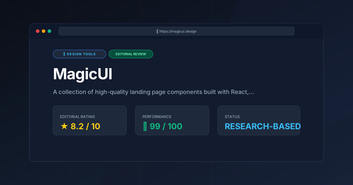
Final Score: 8.2/10 #
Who should use it?
- SaaS Founders: Who need a world-class landing page to attract investors or early adopters.
- Frontend Developers: Who want the aesthetic of a high-end design agency without spending weeks on custom CSS animations.
- Freelancers: Who need to rapidly prototype and deploy visually impressive sites for clients.
Who should avoid it?
- Enterprise App Developers: Building complex, data-heavy internal tools where "flashiness" is a distraction.
- Non-React Developers: Those using Vue, Svelte, or vanilla HTML/CSS.
More Tools Worth Reading
Spline
Design ToolsWeb 3D design made easy. Explore our deep dive into Spline 2026 to see how it transforms interactive sites—read now to optimize your design stack.
Storybook
Design ToolsUI component library management made easy. Explore our deep dive into Storybook 2026 to see if it is the right fit for your design system workflow.
Storyset
Design ToolsFree vector illustrations are the core of Storyset. Learn how to customize, animate, and deploy professional SVGs to boost your site conversion rates.