Shadcn UI Review (2026): The Best UI Components for React?
⚡ Executive Summary
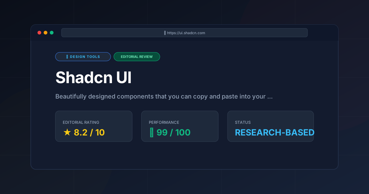
Shadcn UI review (2026). Explore why these ui components are the top choice for React developers seeking total ownership and high performance.
Disclaimer: This review is based on publicly available information, including official documentation, the public GitHub repository, and pricing pages; it is not based on laboratory benchmarks or internal installation tests.
The landscape of frontend development has shifted toward a model of "curated ownership," and at the center of this movement are the ui components provided by Shadcn UI. Unlike traditional component libraries that function as monolithic dependencies, Shadcn UI offers a collection of re-usable primitives that developers integrate directly into their own source code. This architectural decision eliminates the "black box" problem, allowing engineers to modify every line of CSS and logic to fit their specific brand requirements.
Overview #
Shadcn UI components are a collection of accessible, unstyled primitives built using Radix UI and styled with Tailwind CSS. Rather than being installed as a package via npm, these components are copied directly into the project's codebase, granting developers full ownership and total customization of the source code.
Specifications / Fast Facts #
| Specification | Detail |
|---|---|
| License | MIT (Open Source) |
| Hosting | Local (Self-hosted in your repo) |
| Free Tier | 100% Free |
| API Access | N/A (Source code based) |
| Platforms | React, Next.js, Vite, Remix |
Feature Breakdown #
To understand the technical utility of Shadcn UI, one must analyze the three pillars it is built upon: Radix UI, Tailwind CSS, and the CLI.
1. The "Copy-Paste" Ownership Model #
The defining feature of Shadcn UI is that you do not npm install the library. Instead, you use a CLI to add specific components (e.g., npx shadcn-ui@latest add button). This command creates a physical file in your components/ui folder.
Real-World Use Case: Imagine a corporate dashboard where brand guidelines require a non-standard animation for a dropdown menu. In a traditional library, you would fight internal CSS overrides. With Shadcn UI, you simply open components/ui/dropdown-menu.tsx and edit the Tailwind classes or the Framer Motion logic directly. You own the code; you own the behavior.
2. Radix UI Primitives for Accessibility #
Shadcn UI does not reinvent the wheel regarding accessibility (a11y). It leverages Radix UI as its foundation. Radix provides the "headless" logic—handling keyboard navigation, focus management, and ARIA attributes—while Shadcn provides the visual layer.
Real-World Use Case: Building a complex "Combobox" or "Dialog" from scratch is an accessibility nightmare. By using these ui components, a developer gets a tool that is already compliant with WAI-ARIA standards, ensuring the application is usable for people relying on screen readers without writing hundreds of lines of manual accessibility logic.
3. Tailwind CSS Integration #
Styling is handled entirely through Tailwind CSS. This ensures that the components are highly performant, as they utilize utility classes that are purged during the build process, resulting in minimal CSS bundles.
Real-World Use Case: For teams using a centralized design system, integrating the official Shadcn UI site components is seamless. If you have a custom color palette defined in your tailwind.config.js, the components automatically inherit those variables. For those still refining their visual identity, using a Best Color Palette Generator: Coolors Review (2026) & Verdict can help define the CSS variables that Shadcn uses for its theming system.
Implementation Guide: Step-by-Step Configuration #
Implementing these ui components requires a specific workflow to ensure the CLI and Tailwind configurations align.
Step 1: Environment Initialization #
Start with a React-based framework. Next.js is the recommended choice due to its tight integration with the tool's design philosophy. Ensure your environment is running a compatible version of Node.js.
Step 2: CLI Initialization #
Execute the initialization command:
npx shadcn-ui@latest init
During this process, the CLI will prompt you for:
- Style: "Default" or "New York" (which affects the border-radius and padding).
- Base Color: (e.g., Slate, Gray, Zinc).
- CSS Variables: Whether to use CSS variables for colors (recommended for easy theming).
This creates a components.json file, which acts as the registry for your local component installation.
Step 3: Component Acquisition #
Instead of installing a massive bundle, add only the specific elements you need. To add a data table and a dialog:
npx shadcn-ui@latest add table dialog
Step 4: Customization and Implementation #
Import the component from your local folder:
import { Table } from "@/components/ui/table"
At this stage, you can modify the source code in the ui folder. For example, if you need to change the default focus ring color for all buttons, you can edit the button.tsx file once, and it will propagate across your entire application.
Pros & Cons Matrix #
| Pros | Cons |
|---|---|
| Zero Dependency Bloat: Only add the code you actually use. | Manual Updates: No npm update for component logic. |
| Full Source Control: Modify any component's internal logic. | Repo Noise: Adds many files to the /components directory. |
| A11y Out-of-the-Box: Powered by Radix UI primitives. | React Only: No official support for Vue or Svelte. |
| Tailwind Native: Seamless integration with utility-first CSS. | Setup Friction: Requires specific alias and Tailwind config. |
Critical Trade-offs and Limitations #
While the architecture is innovative, it introduces specific technical burdens that developers must consider.
- Manual Maintenance Overhead: Because the code lives in your repository,
npm updatedoes not update your components. If the official GitHub repository releases a critical bug fix or a new accessibility improvement for thePopovercomponent, you must manually merge those changes or re-run theaddcommand, which may overwrite your custom styling. - Increased Repository Noise: In a large-scale project with 30+ components, your
components/uifolder becomes quite large. This increases the amount of code that must be reviewed during Pull Requests and can clutter the project structure compared to a single dependency inpackage.json. - Strict Ecosystem Lock-in: Shadcn UI is strictly for the React ecosystem. Developers using Vue, Svelte, or Angular cannot use these components. While community ports exist, they lack the official support and polish of the original React implementation.
- Initial Configuration Friction: Unlike "plug-and-play" libraries, Shadcn requires a specific project structure and a correctly configured
tailwind.config.js. For absolute beginners, the setup process—handling aliases like@/components—can be a significant hurdle.
Competitor Comparison #
| Feature | Shadcn UI | MUI (Material UI) | Chakra UI | Aceternity UI |
|---|---|---|---|---|
| Architecture | Copy-Paste | NPM Package | NPM Package | Copy-Paste |
| Speed | Extremely Fast | Moderate | Moderate | Fast |
| Pricing | Free | Free/Paid | Free | Free |
| Best For | Custom Next.js Apps | Enterprise Apps | Rapid Prototyping | High-End Visuals |
For those seeking more "flashy" or high-motion components to complement the stability of Shadcn, exploring Modern UI Components: Aceternity UI Review (2026) & Verdict provides a great contrast in design philosophy.
Pricing and Value Assessment #
Shadcn UI is completely open source and free. There are no "Pro" tiers, no subscription models, and no hidden costs for the core components.
From a value perspective, this is an exceptional offering. Most "Pro" UI kits charge for the very thing Shadcn provides for free: high-quality, accessible, and aesthetically pleasing components. The "value" here is not in a paid license, but in the reduction of "boilerplate" time. By providing the foundation, Shadcn allows developers to focus on business logic rather than spending weeks perfecting the z-index of a modal window.
Frequently Asked Questions #
Is Shadcn UI a library? #
Technically, no. It is a collection of components. Unlike a library, you don't install it as a package. You copy the source code into your project, which means you don't have to worry about breaking changes in a version update unless you choose to update the code manually.
Can I use Shadcn UI without Tailwind CSS? #
While technically possible to strip the classes, it is not recommended. Shadcn UI is designed specifically to work with Tailwind. If you prefer a different styling method, you might be better off using Radix UI primitives directly to build your own visual layer.
How does it handle updates? #
This is the primary trade-off. Since the code is in your project, npm update does nothing for your components. To get new features or bug fixes, you generally have to re-add the component via the CLI or manually merge changes from the official repository.
Does it support mobile responsiveness? #
Yes. Because it uses Tailwind CSS, every component is responsive by default. You can use Tailwind's responsive modifiers (e.g., md:flex-row) directly within the component files to tweak the layout for different screen sizes.
Is it compatible with TypeScript? #
Yes, Shadcn UI is built with TypeScript first. All components come with full type definitions, providing excellent autocomplete and type safety within your IDE, which significantly reduces runtime errors in complex UI states.
Final Verdict & Editorial Rating #
Shadcn UI represents a paradigm shift in frontend development. It moves away from the "dependency hell" of the last decade and toward a model of "curated ownership." By combining the accessibility of Radix UI with the styling speed of Tailwind CSS, it provides a professional-grade toolkit that doesn't lock the developer into a rigid ecosystem.
However, the "ownership" model is a double-edged sword. The burden of maintenance shifts from the library author to the developer. If you are building a very small project and want the absolute fastest path to a working UI without caring about bundle size, a traditional library like Chakra UI might be faster. If you are designing complex system architectures and need to visualize your component flow, you might pair this development process with a Virtual Whiteboard Review: Excalidraw (2026) for System Design to map out your UI state before implementing the components.
Who should use it?
- Next.js/React Developers who want total control over their UI.
- Performance-focused teams looking to minimize their JavaScript bundle.
- Design-conscious engineers who want a "clean" aesthetic without writing thousands of lines of custom CSS.
Who should avoid it?
- Developers who are not comfortable with Tailwind CSS.
- Teams who prefer a "set it and forget it" dependency model and do not want to manage component source code.
Editorial Rating: 8.2/10 #
A masterclass in developer experience and architectural flexibility, though the manual update process and repository clutter prevent a perfect score.
More Tools Worth Reading
Spline
Design ToolsWeb 3D design made easy. Explore our deep dive into Spline 2026 to see how it transforms interactive sites—read now to optimize your design stack.
Storybook
Design ToolsUI component library management made easy. Explore our deep dive into Storybook 2026 to see if it is the right fit for your design system workflow.
Storyset
Design ToolsFree vector illustrations are the core of Storyset. Learn how to customize, animate, and deploy professional SVGs to boost your site conversion rates.